Our rebranding
What's behind it?
Video without sound
Why a rebranding?
You're probably wondering why we decided on such a comprehensive rebranding? We need to go into a little more detail. As is so often the case, there were several reasons that prompted us to take this step.
However, our appearance and positioning still reflected the brand of the small agency. As a logical decision, we restructured ourselves and defined our new positioning. To do justice to the new positioning, we needed a suitable and, above all, fresh appearance: a new name, new logo, new design and new services to keep our customers moving forward.
And so, as of February 1, 2024, it was hello world: here comes instride

THE WAY TO THE GOAL
How did we proceed?
The journey was exciting, intensive, enthusiastic and, above all, instructive.
Brand and positioning
We brought a professional on board to work out our new direction, our new tonality, our new positioning in the market, the brand and design principles in a future-oriented way. Hotz Brand Consultants provided us with advice and support.
Name and logo
With the new direction, we wanted a new name and logo that perfectly rounded off and reflected our new brand. After two joint workshops with Hotz and our own internal workshop, it was born: instride.
Design
With the new name and design principles, our internal UX designers developed the new look: style guide, color concept, signs, screen design of the new website and much more.
Visual language
The visual language should also match the new brand. The visual language should apply to images and videos. We brought another professional on board for this: photographer Dario Zimmerli
Content
It was clear that, in addition to a new visual language, new content was also needed for instride's website and online presence. We worked with professionals again for the texts on our website: Pentraprim GmbH.
Website
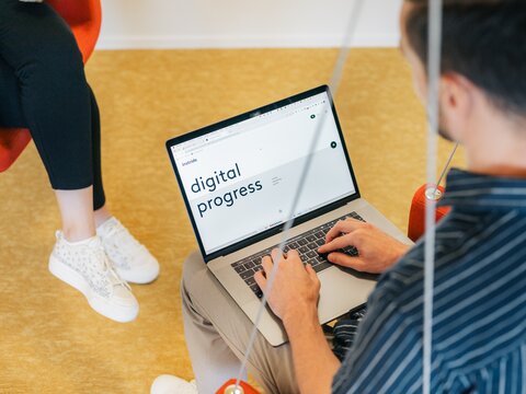
The website was developed internally by our CTO Aaron Gerig. We took the opportunity to make the website accessible to all in accordance with the access for all guidelines.
Marketing
We want to show our new brand to the world: We mainly relied on our online marketing tools for this: social media channels, newsletters, blog posts. But we also had to do a lot offline: Adapting signage in the office and building; creating print products such as writing pads, envelopes, stationery, business cards; designing new merchandise and, last but not least, having our company car re-labeled.
Rebranding event
Last but not least, we naturally wanted to celebrate the new look with our customers, partners and employees. And what is the best way to do this? Exactly, our own big bang event. This took place on February 1, 2024. We unveiled our new brand live on site.
In numbers
What's the story behind the instride name and logo?
instride is derived from the English expression «in stride» and stands for progress or step by step. instride is also hidden in the phrase «to take something in stride» and can be interpreted as «not to be easily thrown off course».
The design language of the instride word mark is based on a geometric structure and radiates precision, simplicity and accessibility. The two-tone color sets an impulse through the «in» and gives the logo recognition. The round design language reflects the accompanying, human and partnership aspect.

LEADING IDEA
We achieve big results with small steps
We support our customers as partners and shape the future together. With technical know-how and tangible energy, we support our customers in the long term. We open up new perspectives. Provide impetus for more possibilities. With ease and genuine pleasure in personal encounters – step by step to success.
Colors, design elements and typography
Colours
With instride, we are immersing ourselves in a new world of color. The colors stand for our new striking, moving, young and creative tonality. Our primary colors «Dark Blue» and «Coral» can also be found in our logo. In addition, we use the colors «Lime», «Blue» and «Cool Grey» as secondary colors.
Design elements
The design language of instride is derived from the design element of the word mark (n). The defined shapes serve to ensure a precise and dynamic overall image. The basic shape can be rotated in four directions, horizontally or vertically. The four shapes served as the basis for our instride.signs.
Typography
The font «Brown LL» fits seamlessly into the word mark and emphasizes the approach of precision and the partnership aspect. A successful harmony that effectively supports the message.

our signs
instride.signs
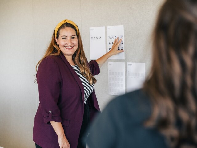
As part of our rebranding, every employee received their own instride.sign. On the one hand, our instride.signs serve as a recognition feature, but above all they are intended to give our customers the opportunity to get to know us better.
The instride.signs were defined on the basis of a personality test. Each sign is as unique as its user.
But not only our employees are proud owners of their own sign. Our services also received specially created and individual signs, again with a focus on individuality and uniqueness.
Tonality
We take a modern and distinctive approach to communication. With instride, we cultivate a «you» culture both internally and in contact with our customers. We pursue the following approaches:
emotional / striking / moving / structured / innovative / young and creative

Nice to see you!
We are delighted that you have made it to this page. Let's shape the future together. Get to know us and our services better.

instride.sign
Perfectionist
Dominique-Claire Bruttel
Interaction Design